A chic take on Spanish tradition
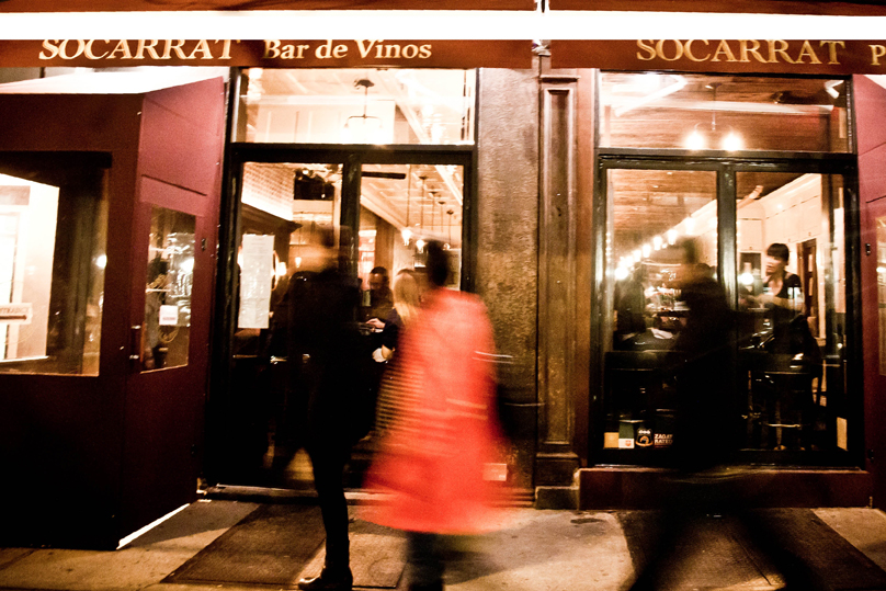
Selected as the best paella in the city by the New York Times, Socarrat takes its name from a local term for the caramelized crust that forms at the bottom of this iconic Spanish dish.
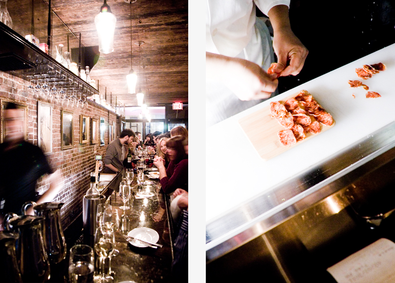
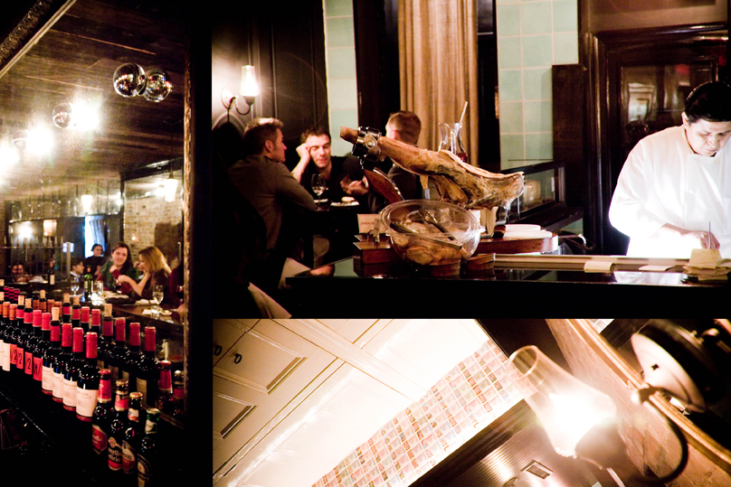
And the deep roots don't stop there. Arranged in communal tables and serving Iberian comfort-food classics, it would almost transport you to a Sunday lunch at a friend's house in Spain if not for the world-class interior design.
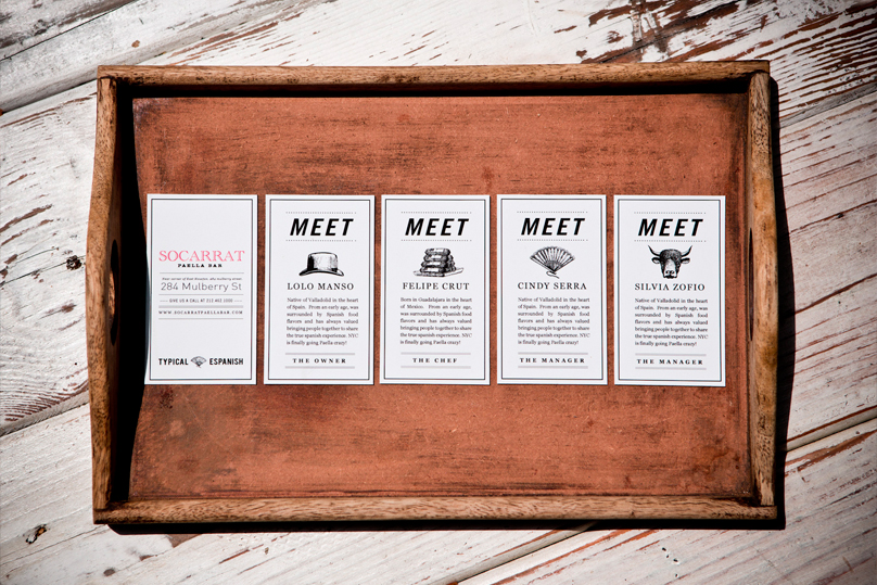
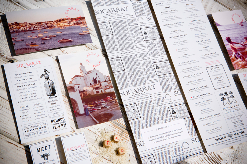
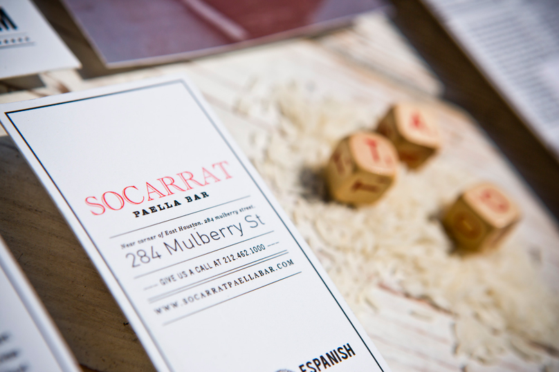
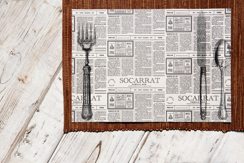
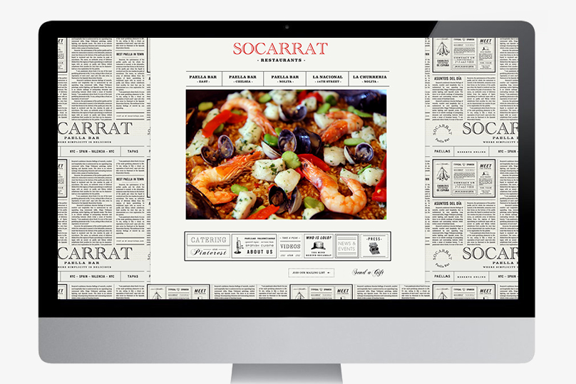
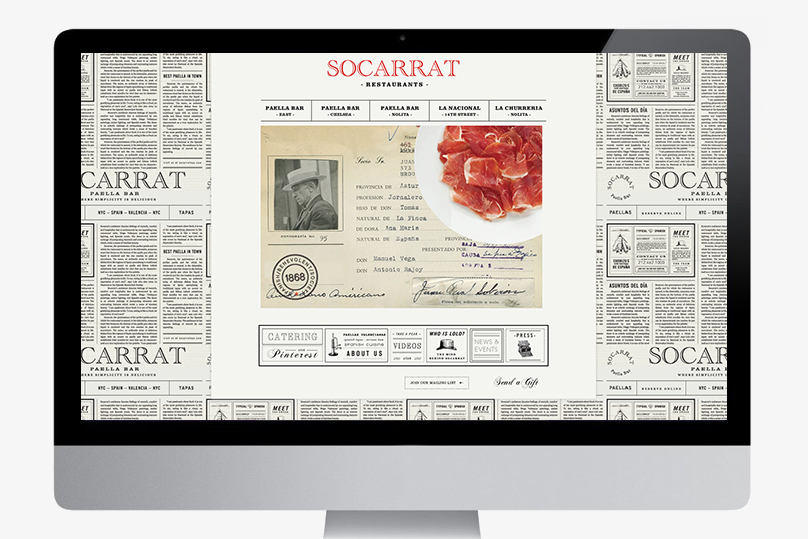
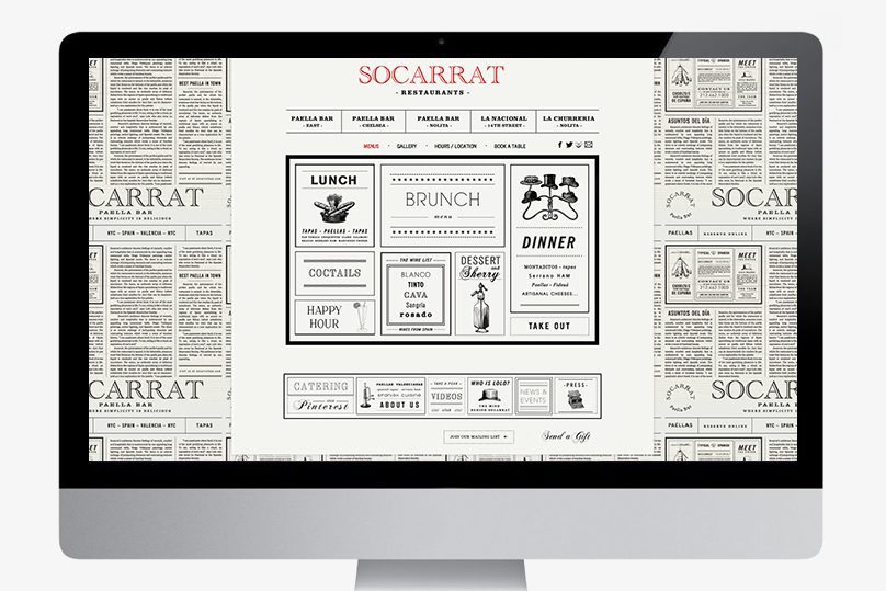
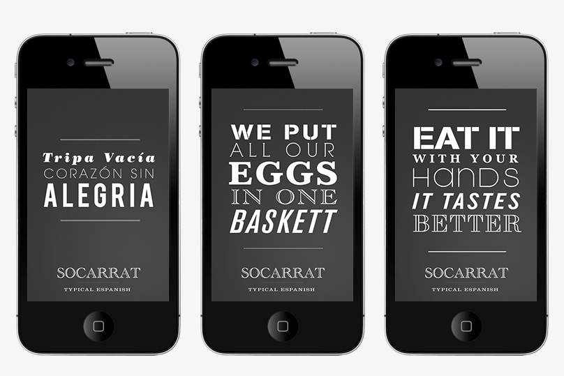
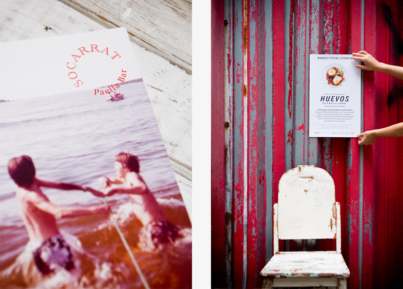
When the restaurant came to us for a brand and verbal identity we strove for that same juxtaposition of groundedness and sophistication. Besides designing new menus, stationary and collateral materials, we also created a buzz around town with posters featuring clever slogans. People were talking as far and wide as London, where the Restaurant & Bar Design Awards featured our design on their list of finalists for 2011-2012.
M+V was Finalist of the BAR & RESTAURANT DESIGN AWARD 2012 (London)
for The Socarrat' Branding!
Verbal and Brand | Identity | Menu Desing | Stationary | Collateral | Web
