Luxurious fashion hits the city streets for a modern revamping
GoSilk premiered its first collection in 1977, and since then has earned a following with its effortless, wearable silk garments. But when it came time to launch an updated line designed with both younger fashionistas and loyal customers in mind, we stepped in to give the brand a 21st-century makeover.
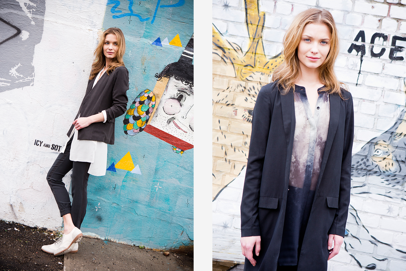
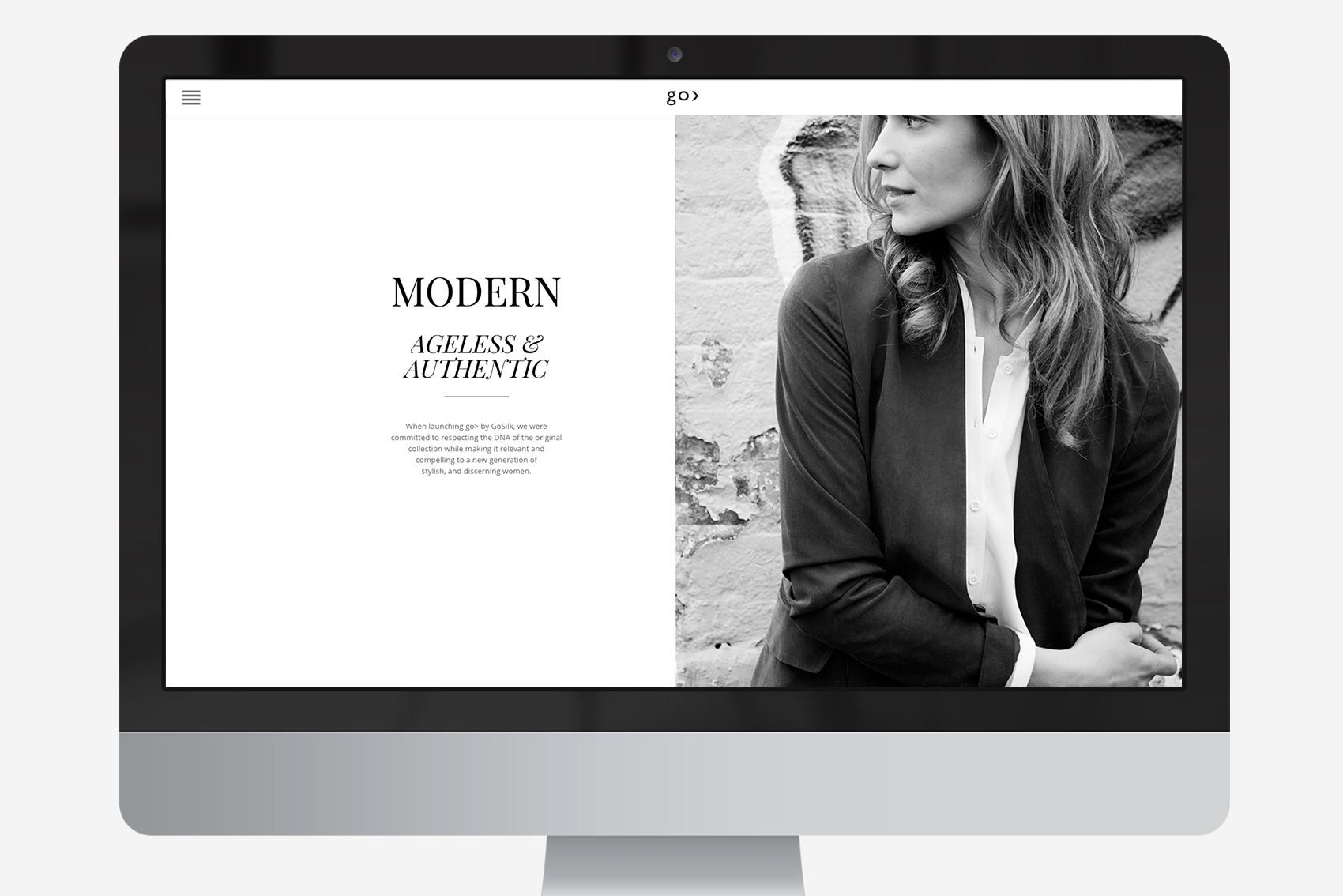
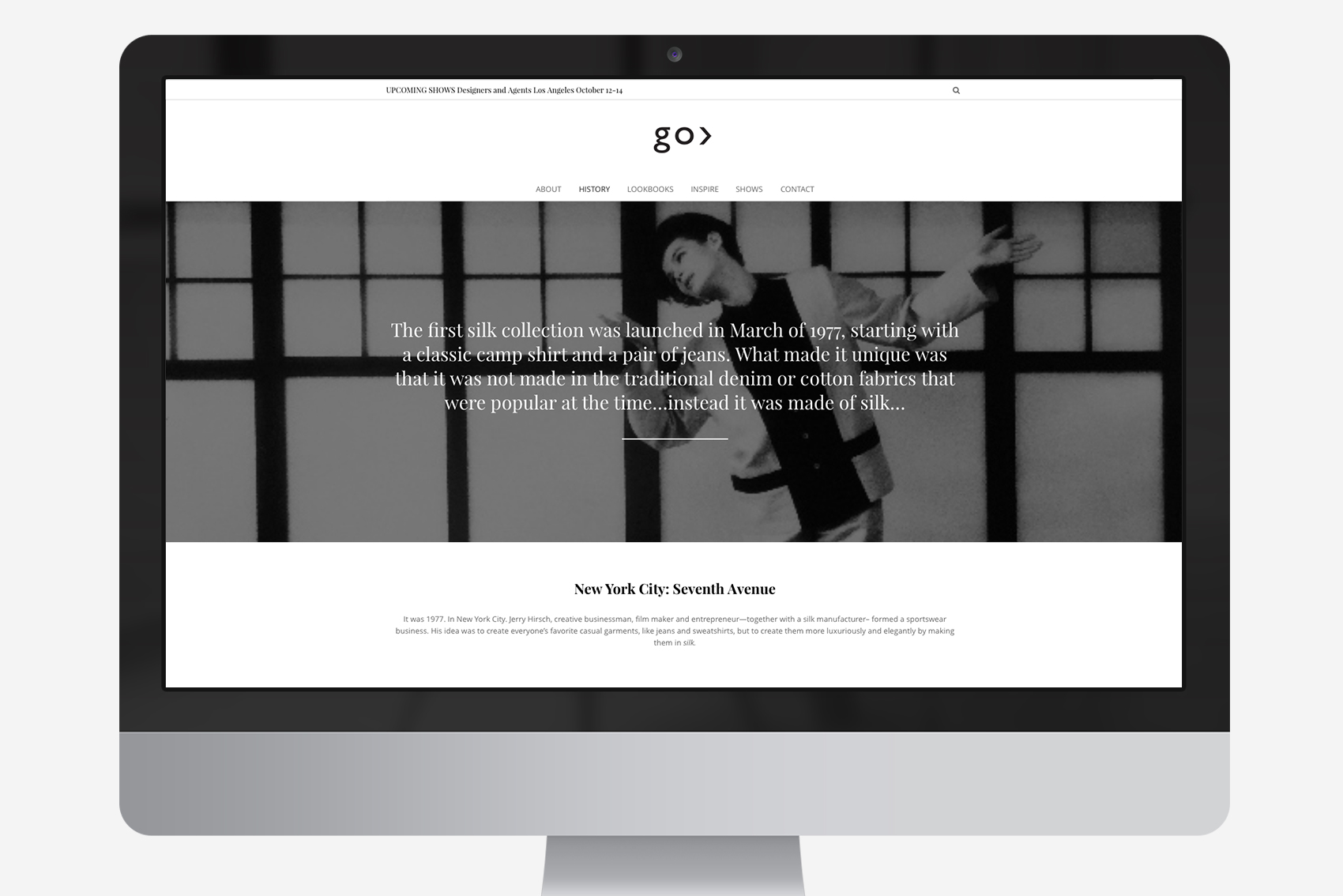
We created a new logo and website, keeping a simple layout and color scheme with specific design touches to evoke high-end style and diversity. The vibe of New York chic also resonates in our photos of the collection, shot against the fresh backdrop of some of Manhattan and Brooklyn’s coolest neighborhoods, evoking elegance, trendiness and fun.
You want to take a look at the Behind the Scences: click here!
Website: Go >by GoSilk
Creative Direction | Art Direction | Branding | Photography | Web


