A crowd-pleasing look for a New York home away from home
A legend in its own right, this classic haunt has been feeding Spaniards and Latin Americans in New York since the 19th century from a historical brownstone in the heart of what was once known as "Little Spain".
La Nacional, officially the cantina of the Spanish Benevolent Society, had never even had a logo, just its name scrawled in Sharpie, but with the building undergoing a facelift and the non-profit reaching out to a new generation of members, it was time for the restaurant to follow suit.
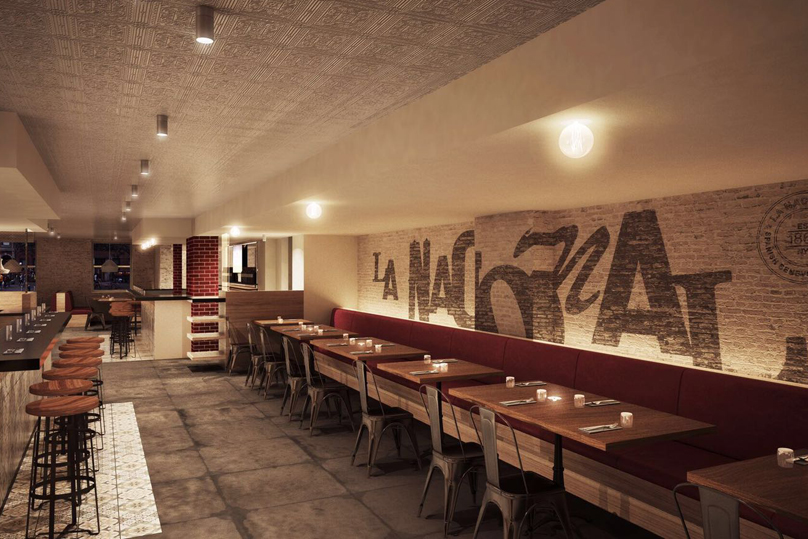
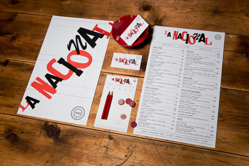
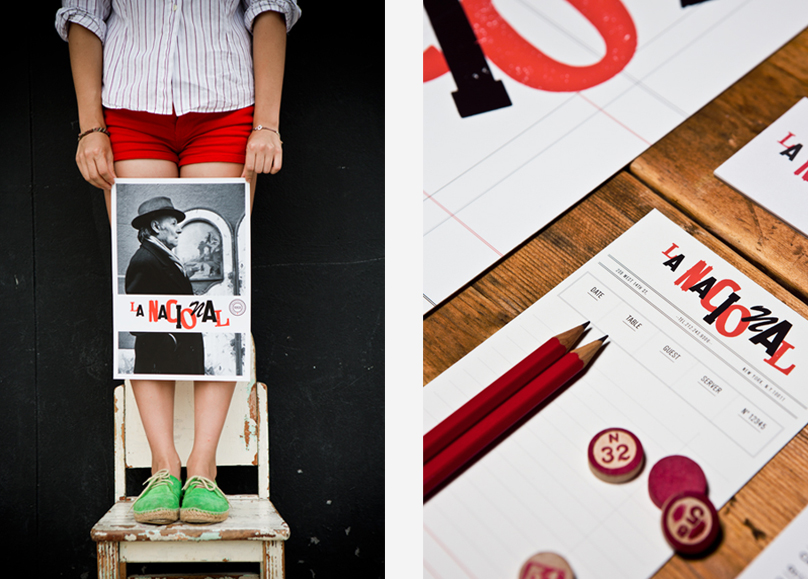
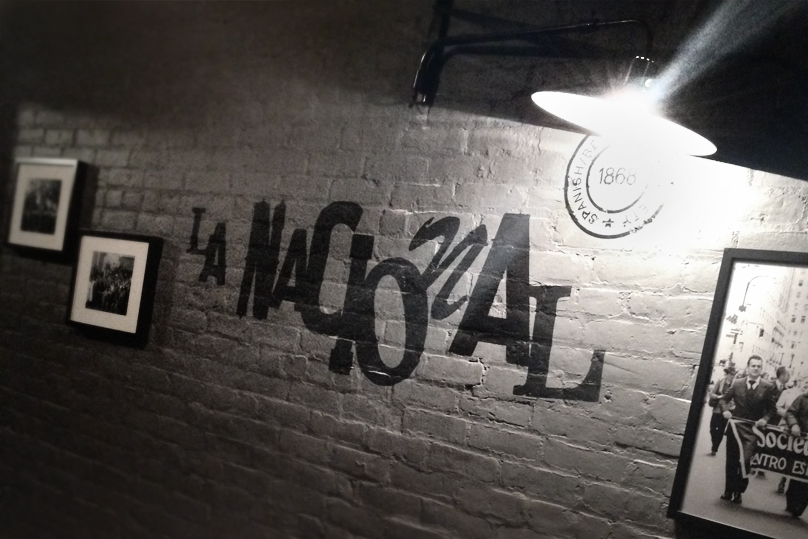
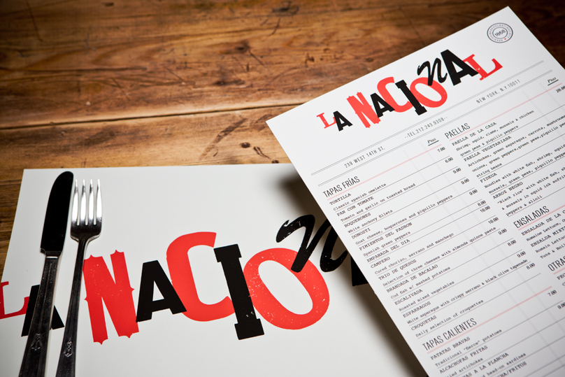
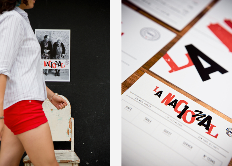
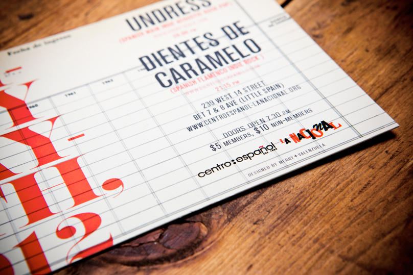
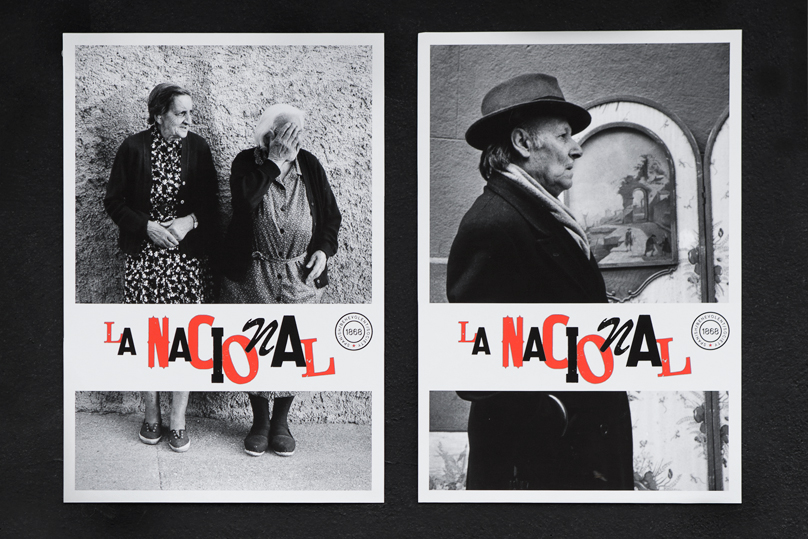
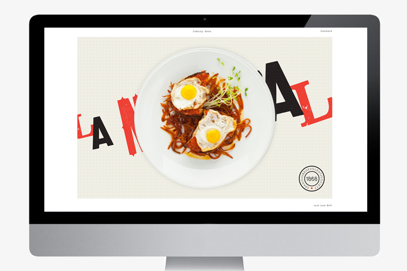
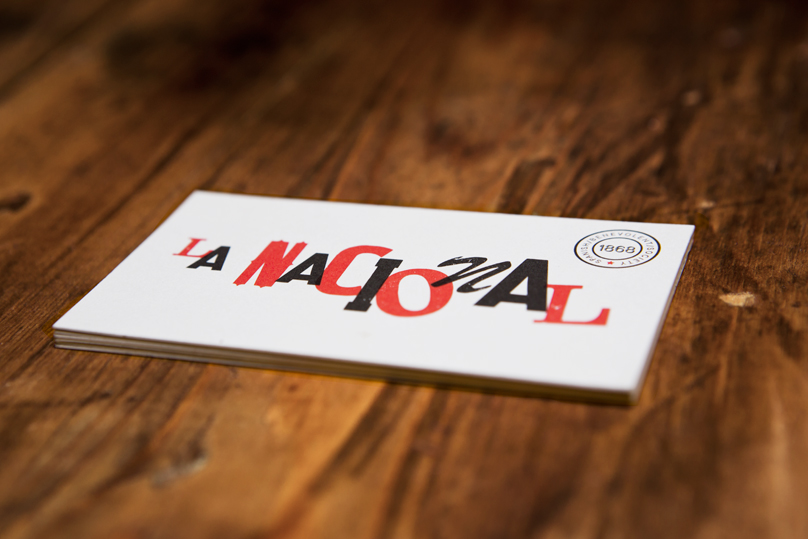
In developing a new brand identity, we knew it had to be something democratic that would appeal to the wide array of people who call La Nacional their second home. The menus and signage use an antique wood type that recalls the restaurant's old-country vibe, while the synergy achieved through a mix of fonts is a reflection of its spirit.
Brand Identity | Menu Design | Photography | Collateral | Signage
