Next-generation strategy for an old-world classic
The Spanish Benevolent Society of New York
Manhattan, New York
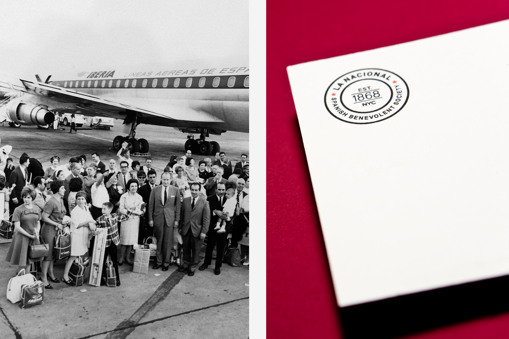
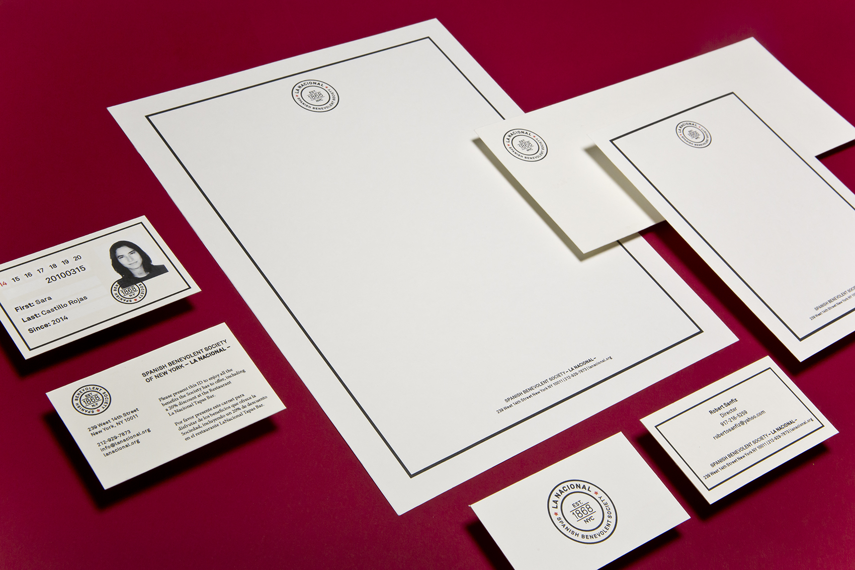
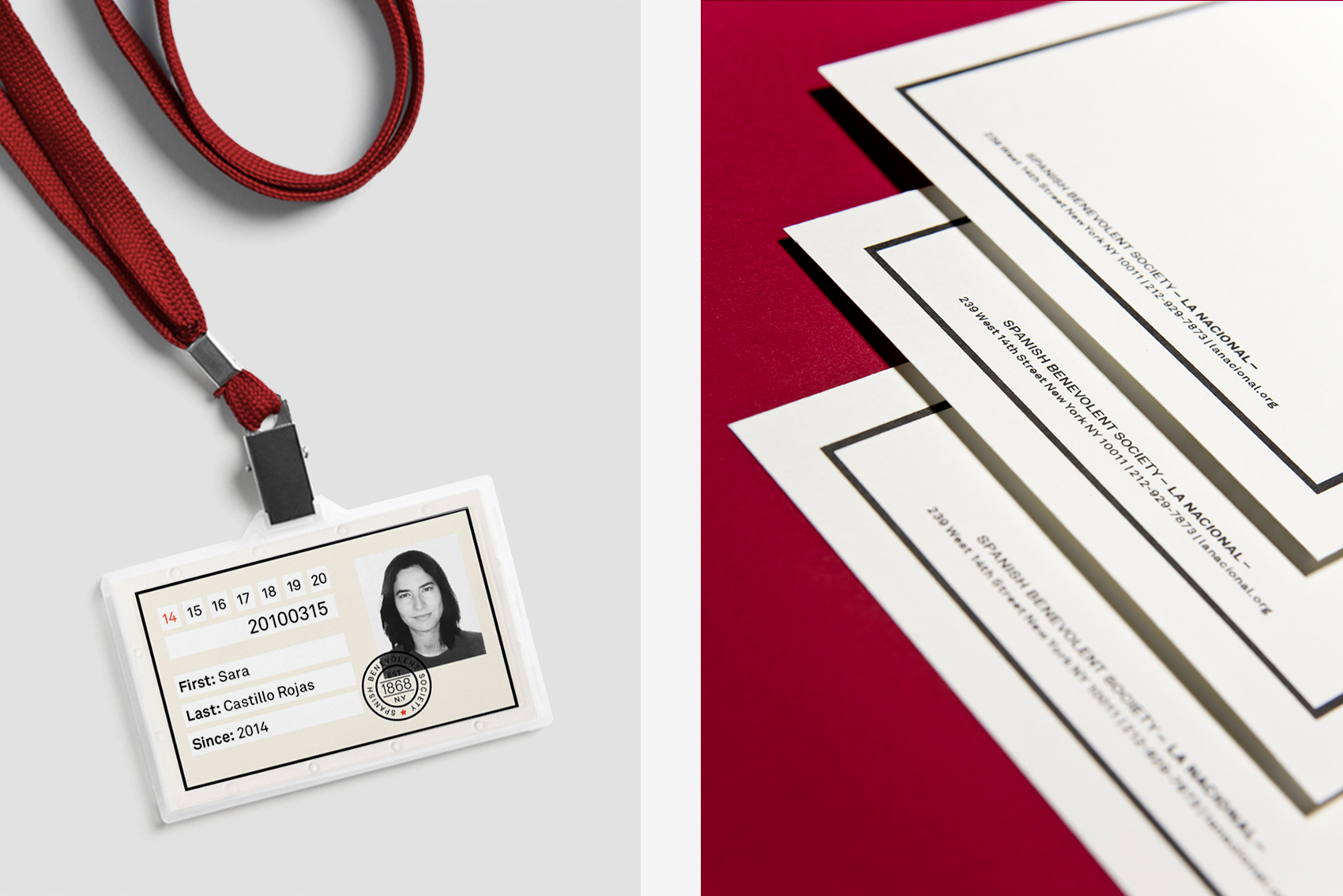
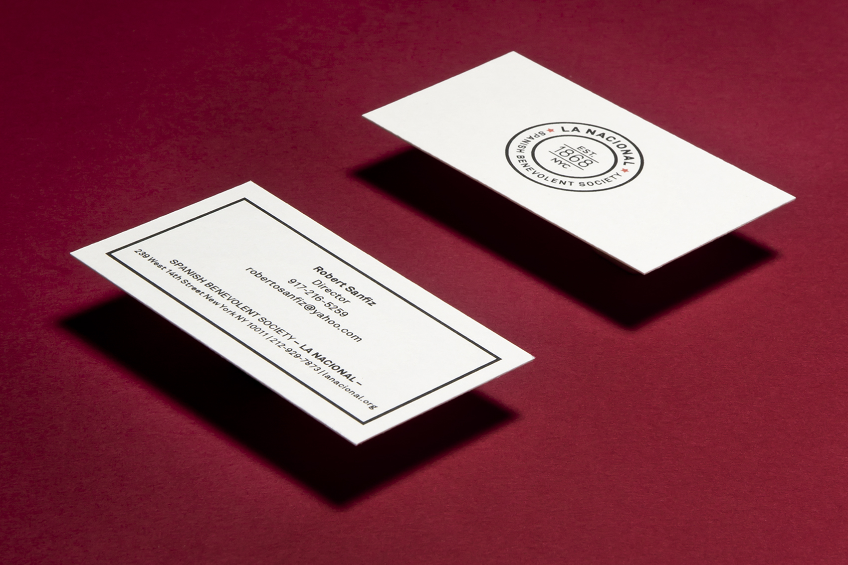
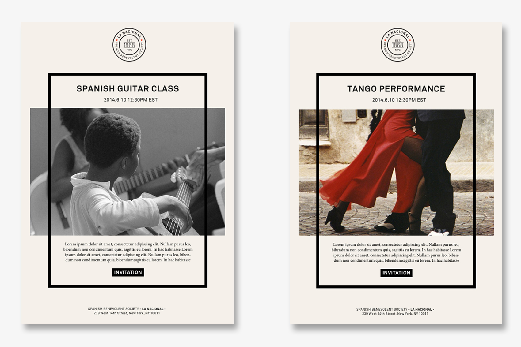
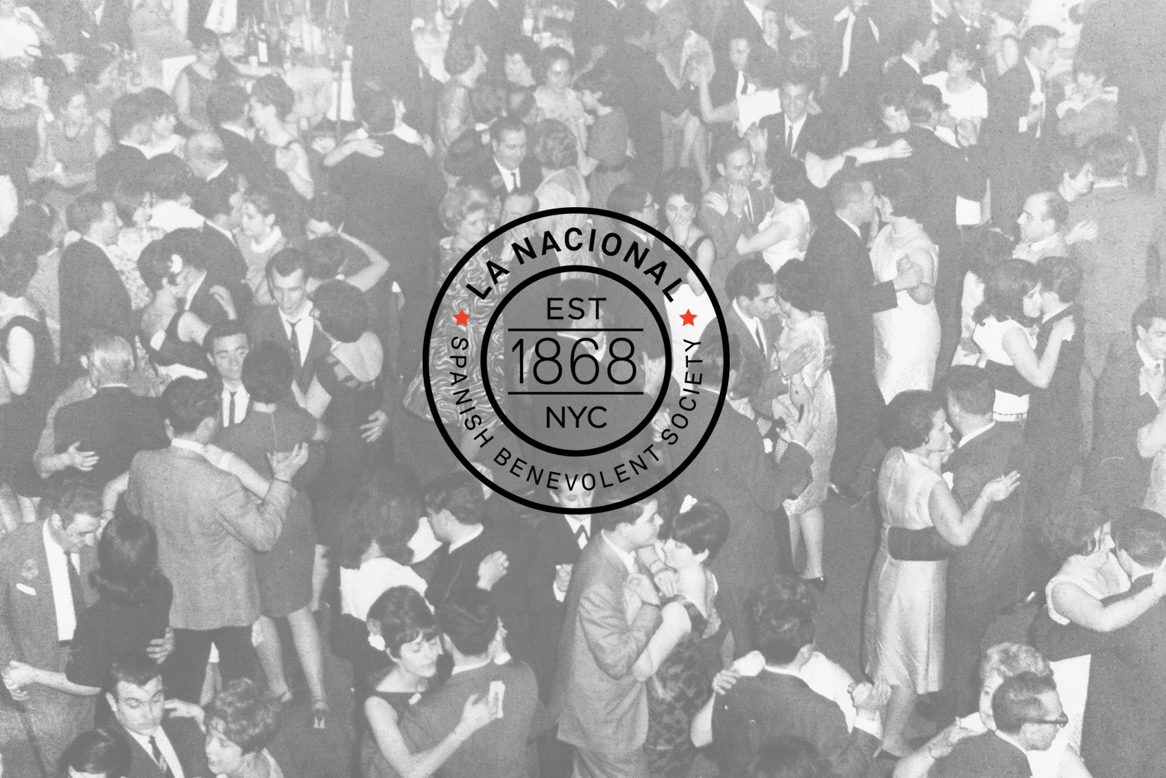
Following the rebranding of its iconic eatery, we brought the charitable arm of The Spanish Benevolent Society (La Nacional) up to date with a new look and feel across its online and brick-and-mortar properties. Timeless fonts, simple graphics and a restrained color palette provide this New York institution with a fresh, modern image to tie in with the restaurant and attract a younger audience.
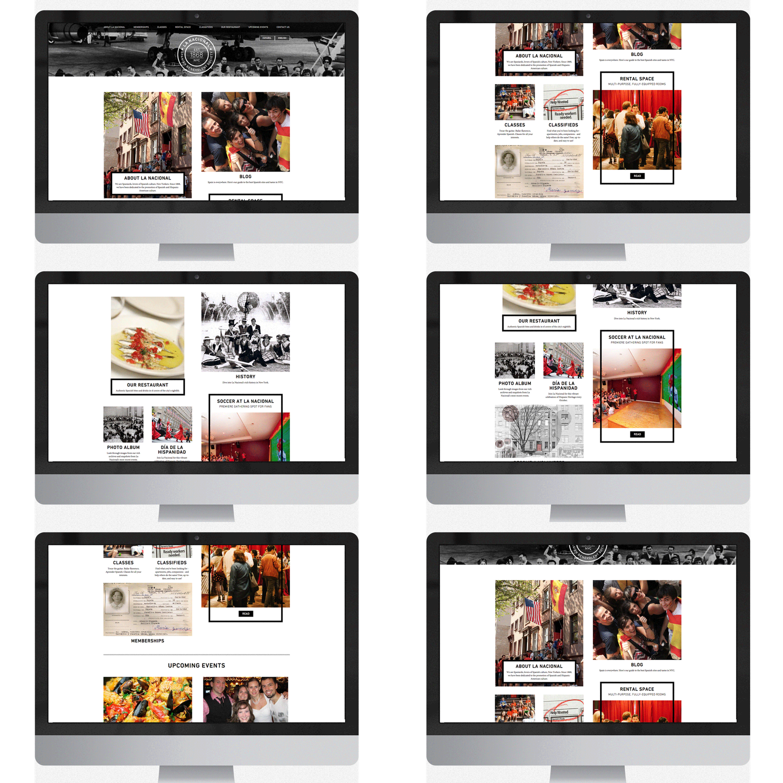
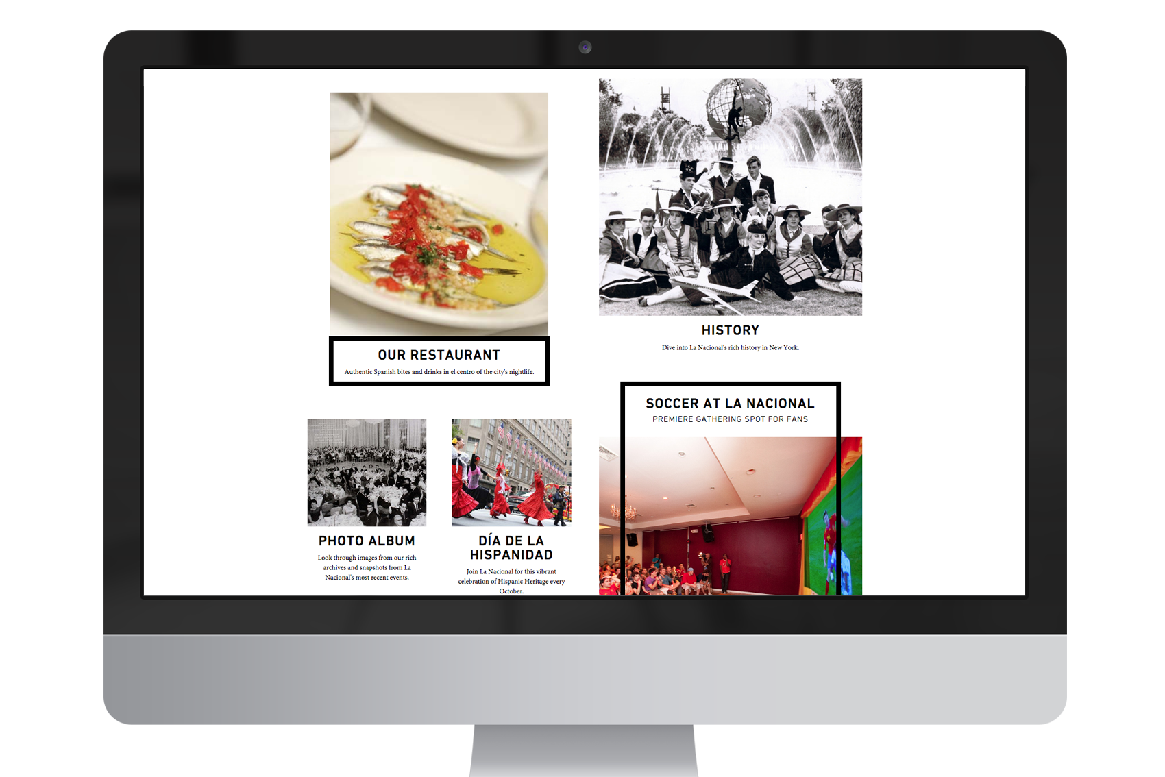
The branding extends to the organization's website with a floating, dynamic layout inspired by old-school bulletin board posts. Asymmetry affords an interesting user experience across all devices and platforms thanks to responsive web design.
Creative Direction | Identity Design | Stationary | Web Design | Collaterals |
