An effervescent new look for a unique wine
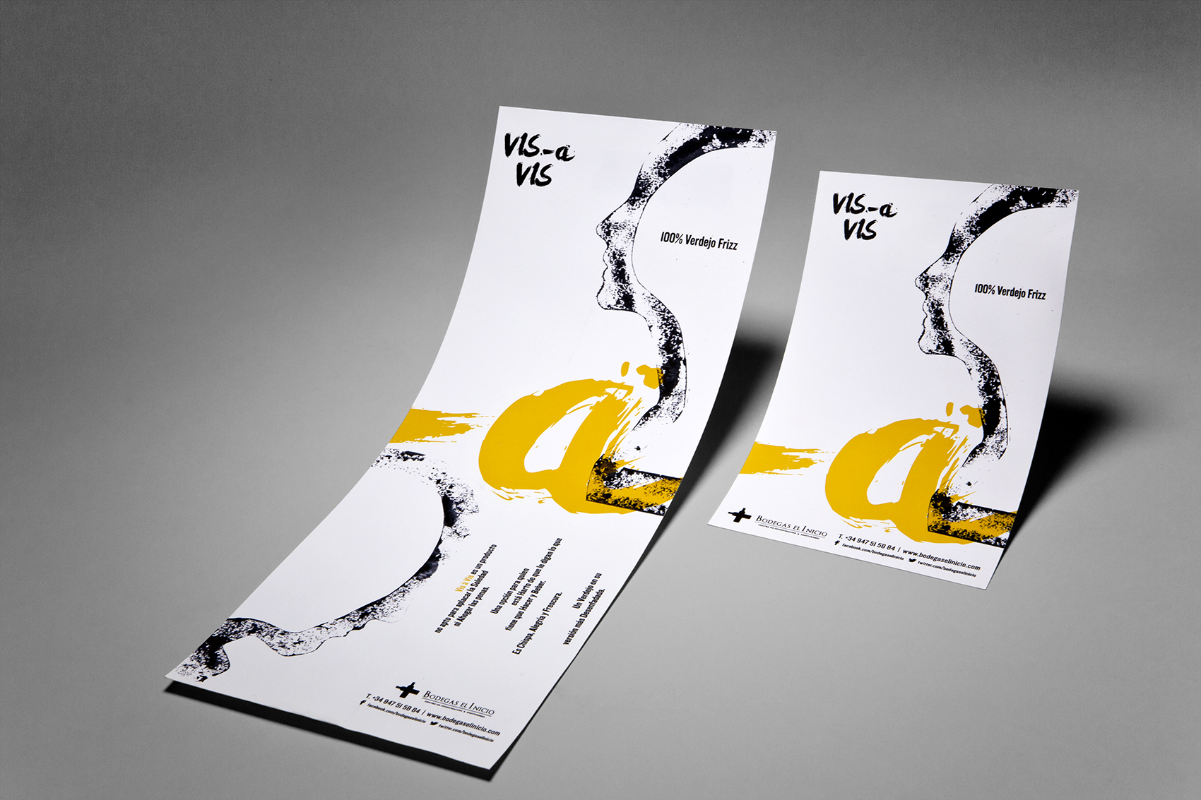
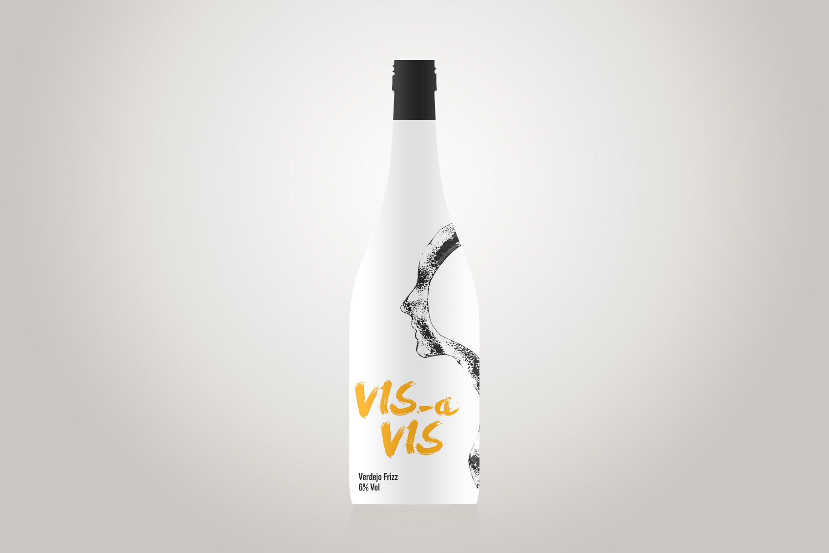
A singular process, a singular product: that’s the story behind Vis a Vis, a sparkling wine made using 100% Verdejo grapes, and clearly deserving of an out-of-the-ordinary design. To stand apart from the ever-growing number of Spanish bottles populating the wine stores of cosmopolitan cities, Vis a Vis came to us to create something more feminine, more upscale, and even a touch artsy.
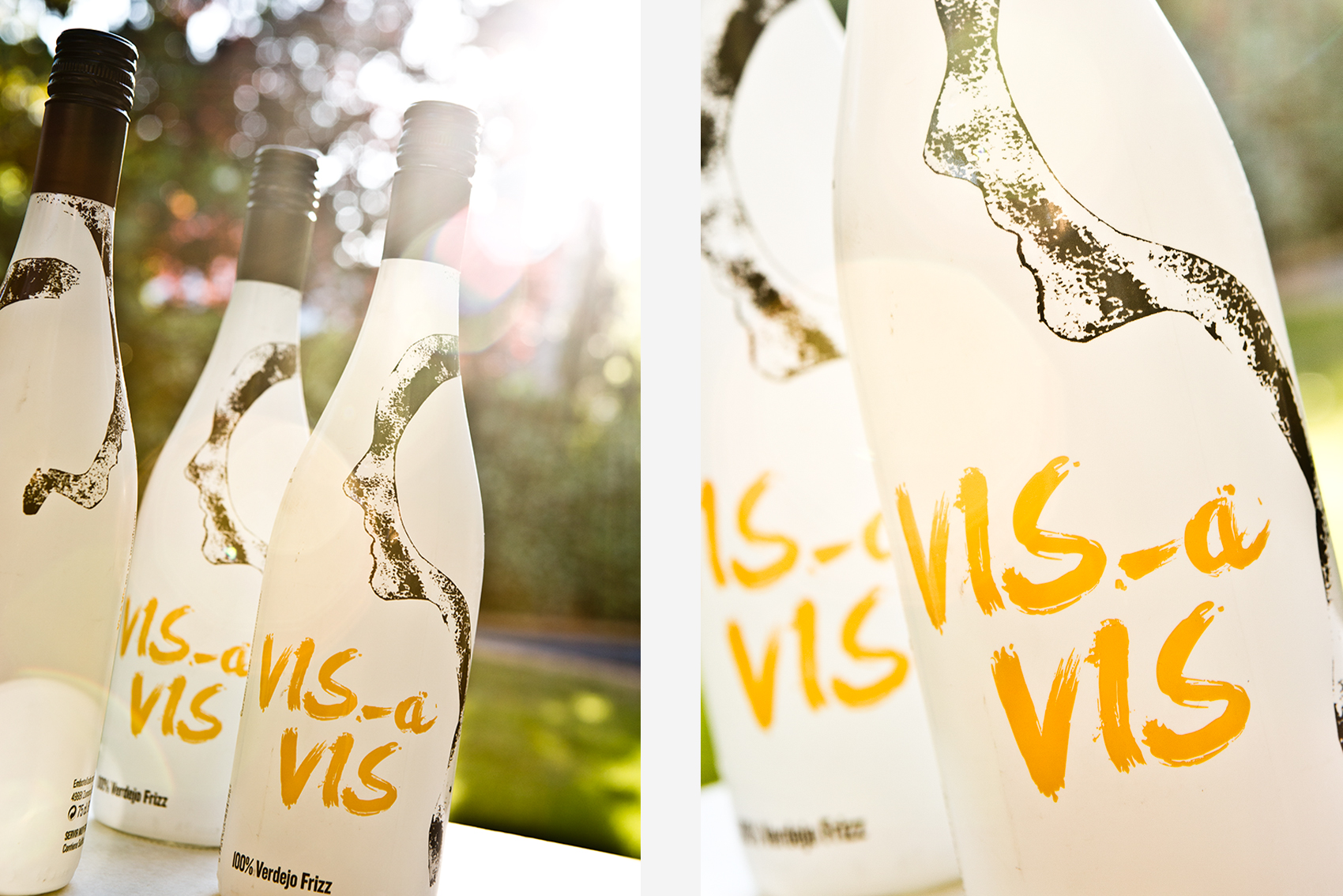
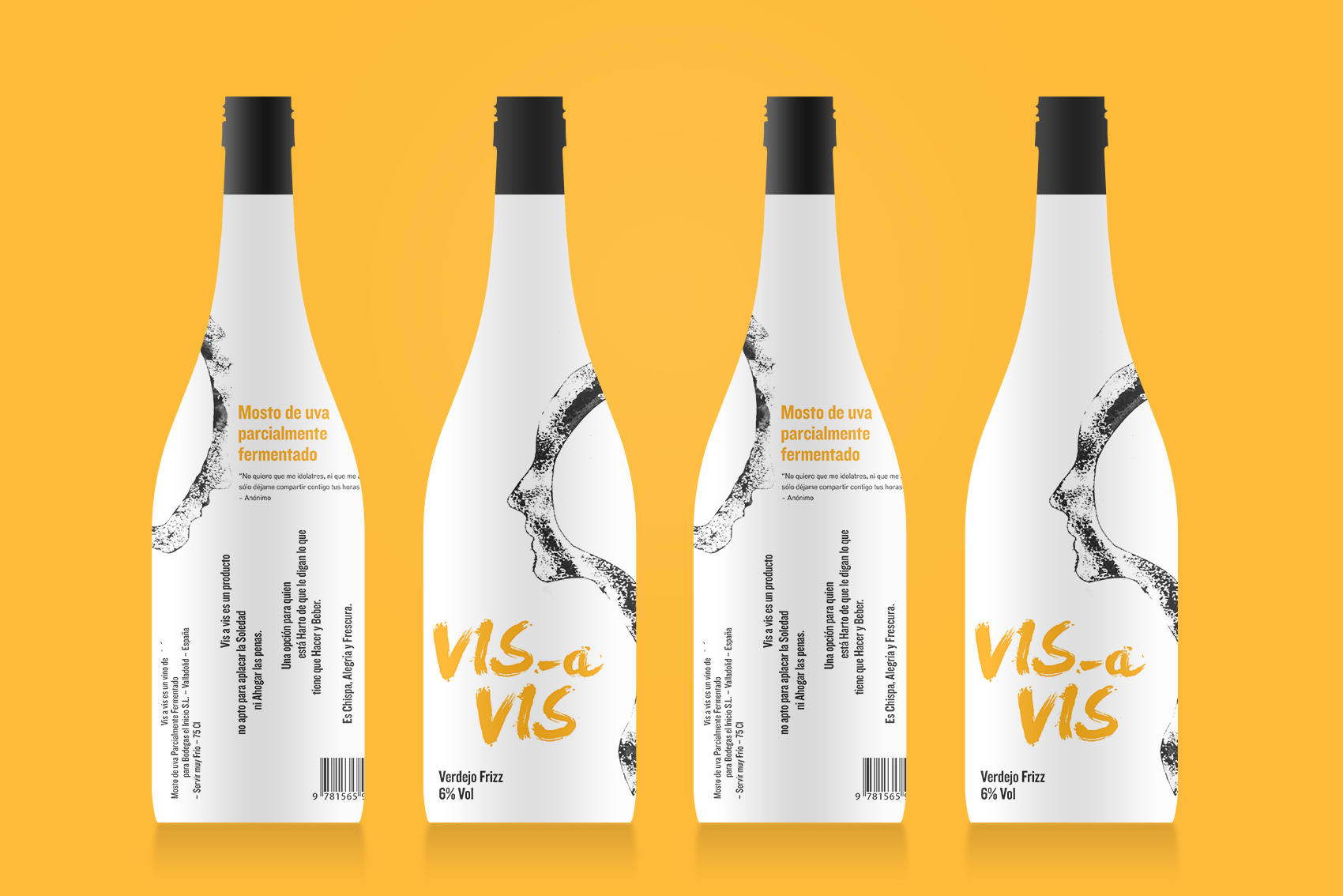
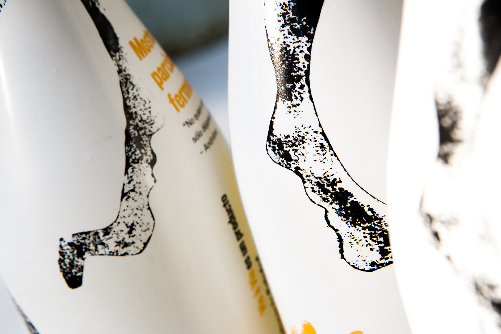
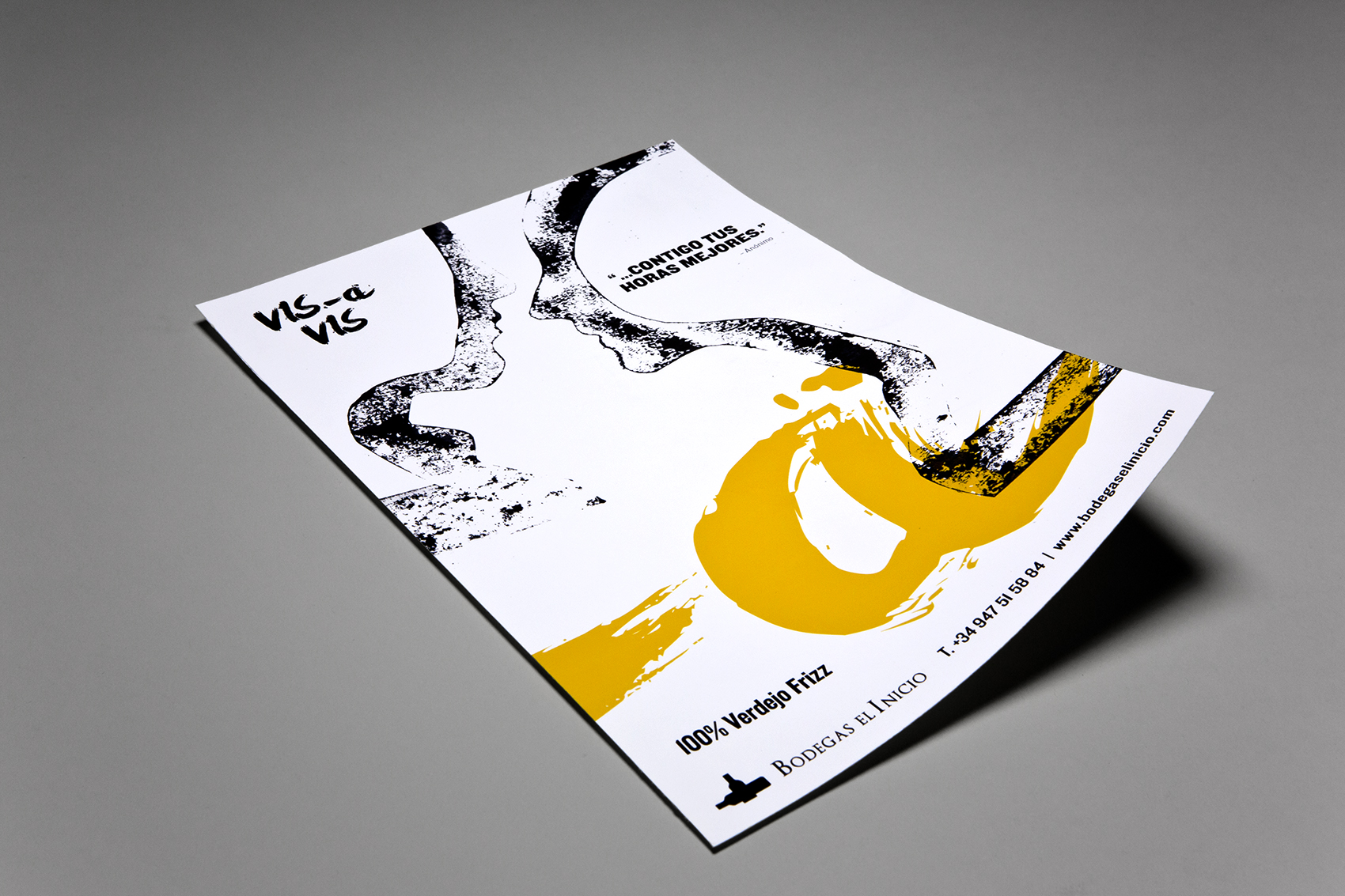
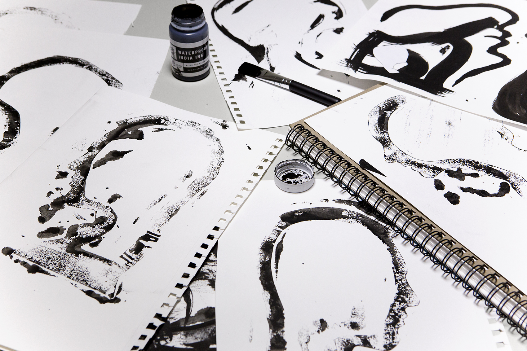
Our first instinct was to forget everything we’ve come to know as Verdejo, starting with the color. We replaced the traditional green used to represent this variety with a warm yellow, evoking the Mediterranean. The bottle would be white, slowly baring its contents like a well-guarded secret. Finally, the imagery: representing the brand name (which translates as “face to face”) with a drawing of two faces that subtly reveal themselves as the bottle is turned.
Creative Direction | Identity Design | Verbal Identity | Photography | Packaging |